RE: Splinterlands Art Contest! // Week 164 // 10 Booster Pack Prize!
You are viewing a single comment's thread:
Definitely, here is my list:
I don't mean to offend anyone, but if you can' take the critique as an artist then you probably picked the wrong path.
The first 4 pieces are equally good, so any of them could take the top 3. I would put naga at number 4 just because this artist was highlighted many times before.
1 . @h-t-t https://peakd.com/hive-13323/@h-t-t/splinterlands-art-contest-week-163-harklaw
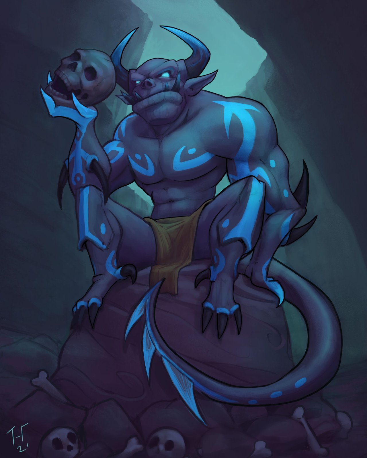
Besides the lack of stronger shadows, everything looks amazing here. Colour palette, scene, idea - 5/5. Plus it's a newcomer, I bet a highlight and a reward would definitely motivate this person to show more of his art in the future.
2 . @berien https://ecency.com/splinterlands/@berien/splinterlands-art-contest-week-163
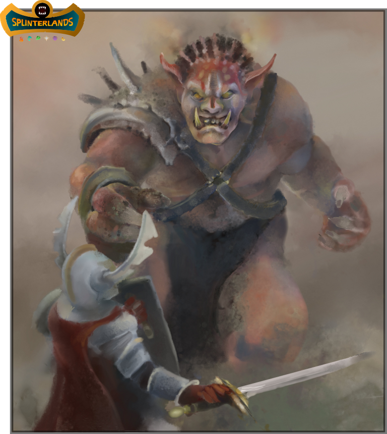
I am not gonna go into details as they were picked as winners, but in my opinion, this should be in the top 3. Reasons: Original, high quality.
3 . @artgraf https://hive.blog/hive-13323/@artgraf/splinterlands-art-contest-week-163-goblin-sorcerer
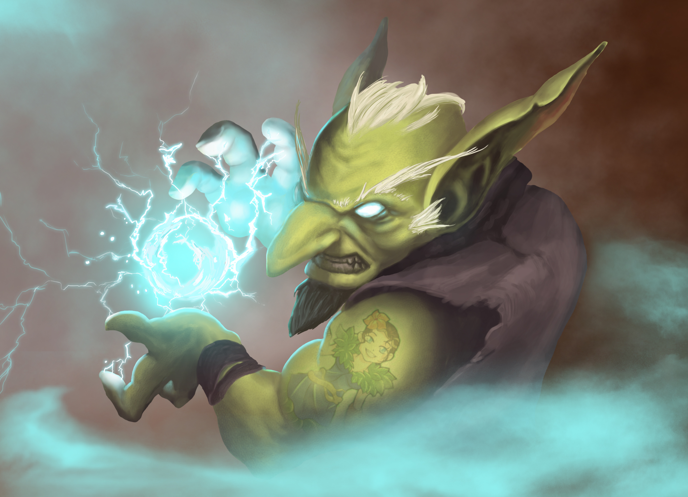
We agree on this one.
4 . @japex1226 https://hive.blog/splinterlands/@japex1226/splinterlands-art-contest-week-163-naga-warrior
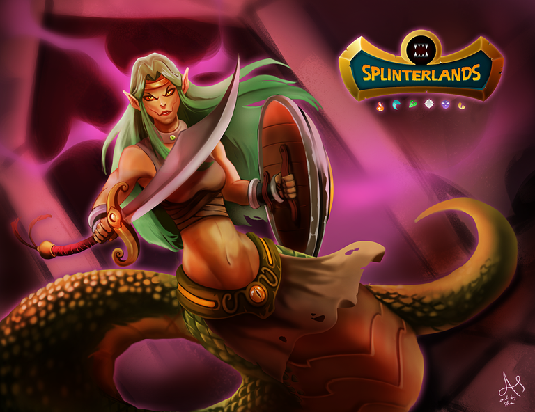
Once again, I have seen this artist many times before taking the top positions, that's why he is moved from top 3 to position number 4.
In my opinion, the first 3 positions should always be the highest quality pieces, position 4 equally good, but maybe not as original. 5 & 6 good quality, but maybe lacking originality, or in some other aspects.
The last one should be the place for people that are trying hard, but the art is not as good as the rest.
5 . @darksonata https://hive.blog/hive-13323/@darksonata/splinterlands-art-contest-week-163-champion-s-footsteps

Simple, but stands out from the rest.
6 . @ryoudo https://hive.blog/splinterlands/@ryoudo/splinterlands-art-contest-week-163-elven-cutthroat
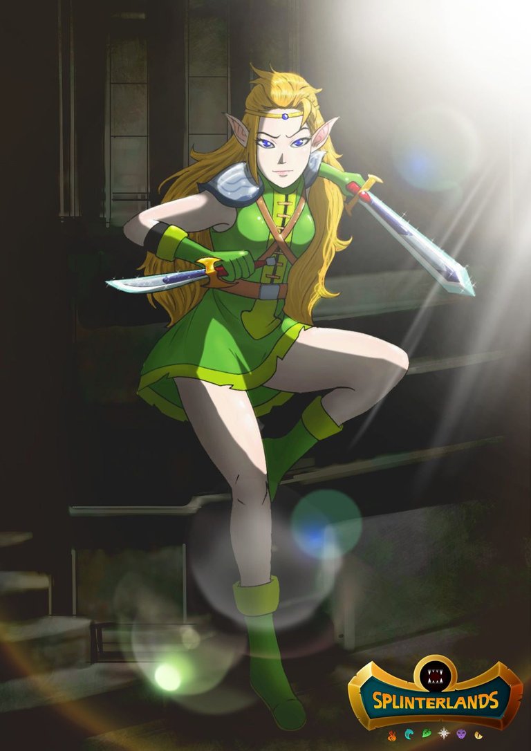
This one is lacking something, maybe the contrast between light and shadows is too strong, but still a good piece.
7 . @vrezyy https://hive.blog/hive-13323/@vrezyy/splinterlands-art-contest-week-163-naga-warrior

I noticed that it was posted too late? If that's the case then
@collectorofchaos https://hive.blog/splinterlands/@collectorofchaos/skeleton-warrior-splinterlands-art-contest
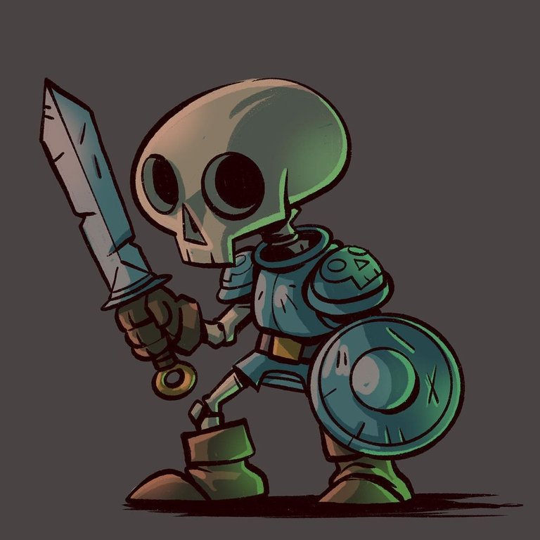
Cute and simple, yet it maintains the quality.
Now for the artwork that was dropped from your list :
Number 1 - He got highlighted last week with the same style entry, looks low quality and it's not original at all, we have seen similar renders many times before, I wouldn't even put that in the top 7.
Number 2. It's not as bad as others but still looks messy, the colors are awful, the contrast is just too strong.
Number 7. Looks crappy, like it was made in 2001. He was highlighted some time ago with a similar render. The scenery looks almost the same, I wouldn't even be surprised if that was a premade asset that got downloaded.
@castleberry I think you don't take into consideration a few things like:
- Was this artist listed before? (How often? Maybe it's time to give a chance to someone else)
- How long it could take to make the particular artwork (how much effort was needed)
- Is it original? Or is it just the same style and almost a copy of the previous work or maybe a copy aka " inspired" by something other than the game?
- The quality of the artworks (or the lack of quality)
- Does it really deserve the top 3 position?
Here is a good quote: "Artwork will be judged using the following criteria: uniqueness/originality, professional quality (neatness and craft), aesthetic quality (design, composition, color/tones), concept, selection and application of materials, and complexity/level of digital technology used."
A perfect example of "level of digital technology used" is your 7th pick, it's just outdated.
Nothing personal, neither to You or the artists, but as someone else mentioned before at this point it's more of a giveaway than a contest.
I would also kindly ask @rowell and @telumen to add anything I missed since I noticed their disappointment with how the contest it run.
I'm just happy to be here.
I can honestly fully agree.
I'm just having fun bro
This is what i thought too.
"the first 3 positions should always be the highest quality pieces, position 4 equally good, but maybe not as original. 5 & 6 good quality, but maybe lacking originality, or in some other aspects.
The last one should be the place for people that are trying hard, but the art is not as good as the rest"
"Was this artist listed before? (How often? Maybe it's time to give a chance to someone else"
I mostly agree with the list.
First place, is truly a very well made piece.
I would move your 2nd pick lower, while semi realism is hard, this piece lacks sharpness and is a bit too smudged for my taste. In comparison, 3rd place on your list has more definition to it.
I would also swap 6th and 7th picks
Also, I went over last week's entries, and I would put this pixel icon on the winners list - while the work itself is of small format, it is a well made pixelart piece, with proper color palette and idle animation.

https://peakd.com/gif/@captainglondo/splinterlands-art-contest-week-163-venari-crystalsmith
@aak23 I appreciate that you actually took the time to make the list you would have selected. I think you have some interesting points in your critiques... though, i think there is a difference between constructive criticism and just negative criticism.
It's good to have this list to compare and contrast how we went about selecting last week's winners. Ironically, we actually applied some of the things you don't think i consider. Thanks for the suggestions and moving forward we will keep in mind some of what you have expressed.
I wish you guys would support the art you like in the comments as much or more than you do agreeing to disagree with the winners. I think you all should start your own SL art contest and curate your entries with your upvotes and give out cards or packs to your selected winners.
Thanks for the response.
You mean like this?
This ^^^ is the first time I've ever hopped in to look at the comments at all, I just curate the posts (I'm one of the main curators for @monster-curator) along with dozens or hundreds of others every day.
Exactly like that Kenny. In this comment section as well!
I won't comment the choices that were made: as in sports in a contest, contestants just have to comply with decisions. I mainly use the contest as a personal trial, forcing myself to follow guidelines in a certain delay, so I'm happy my own piece was selected among the winners as a bonus.
Although, I like the part of @aak23 's text highlighted by @Ryoudo, as it gives a neat checklist to apply at each round of selection process, adding a bit of technical objectivity in a highly subjective domain:
"the first 3 positions should always be the highest quality pieces, position 4 equally good, but maybe not as original. 5 & 6 good quality, but maybe lacking originality, or in some other aspects. The last one should be the place for people that are trying hard, but the art is not as good as the rest" "Was this artist listed before? (How often? Maybe it's time to give a chance to someone else"
thanks a lot for this !! means a lot