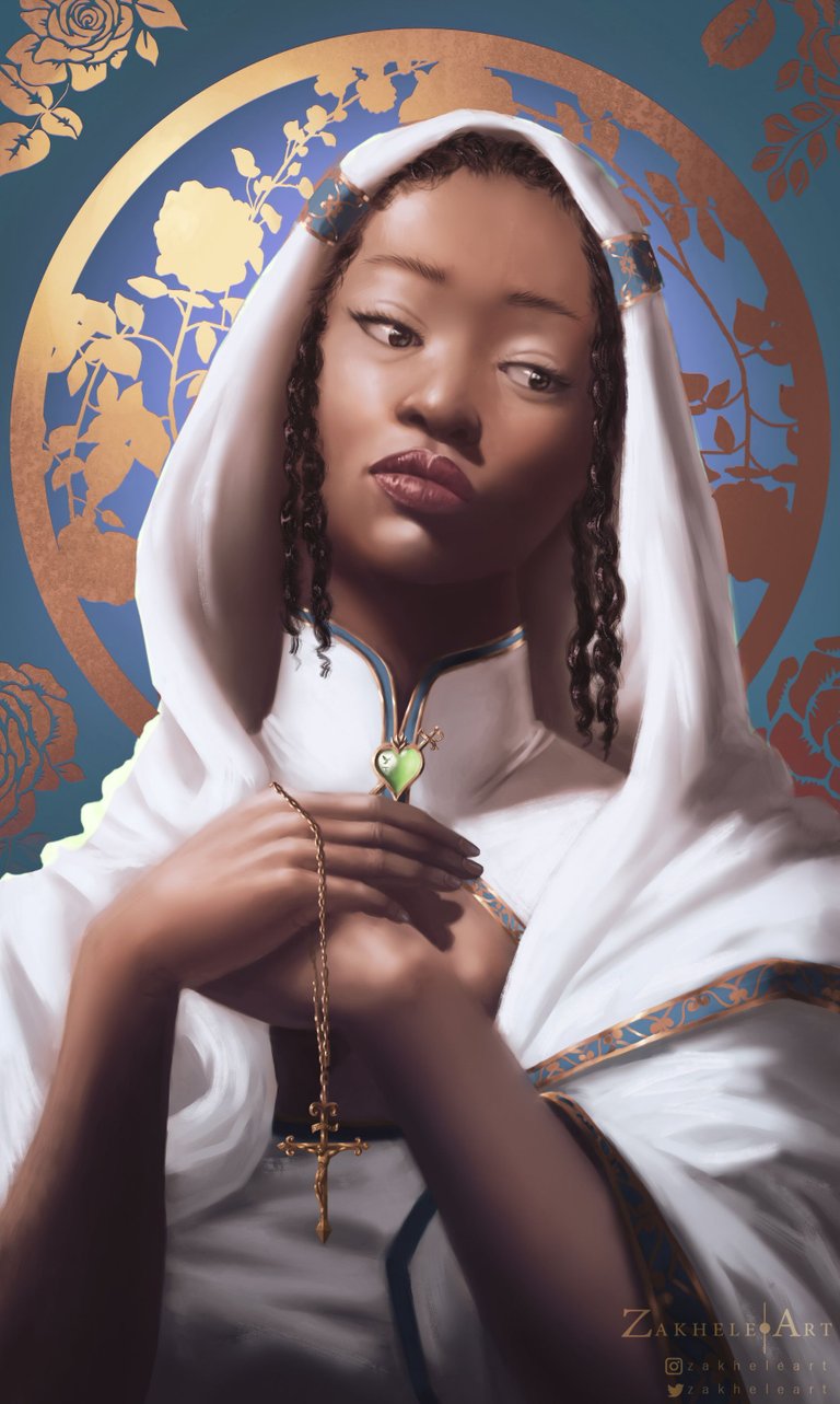
SAINTLY || Portrait Commission
Hello, Extraterrestrial
I've tried hard to keep a consistent post schedule on here but can't seem to get a handle on that with commission work and training. This is one of those commissions. this is a piece I did for a good friend of mine, Lindi. now that it's I've got a semi-open schedule.

This is one of four commissions (with 3 still to be done in the future) and was a difficult piece to get done because I needed to get very close to the likeness, which is something I hadn't done in a long while in my art. I had to deploy my reference material in a very critical way looking at the "why and how" of the form in an almost classical sense.
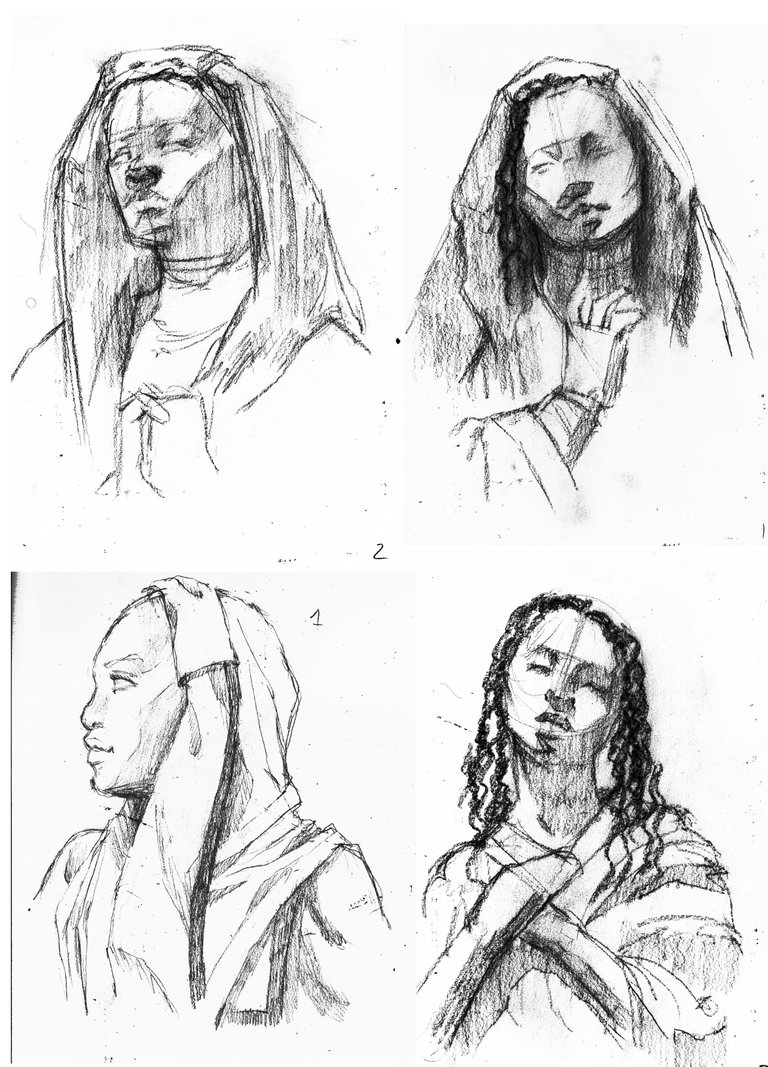
Sketch
As always, with commissions, I start with a couple of sketches to find the best idea. ended up having to merge sketches two and four together because the client really liked those two and to be honest I really liked those two, myself also.
In the future I think I might just do sketch number three because I really liked that composition. It's very simple, straightforward. I already did a mock up for it, but I haven't posted. I hope to get it done too and share with you all.

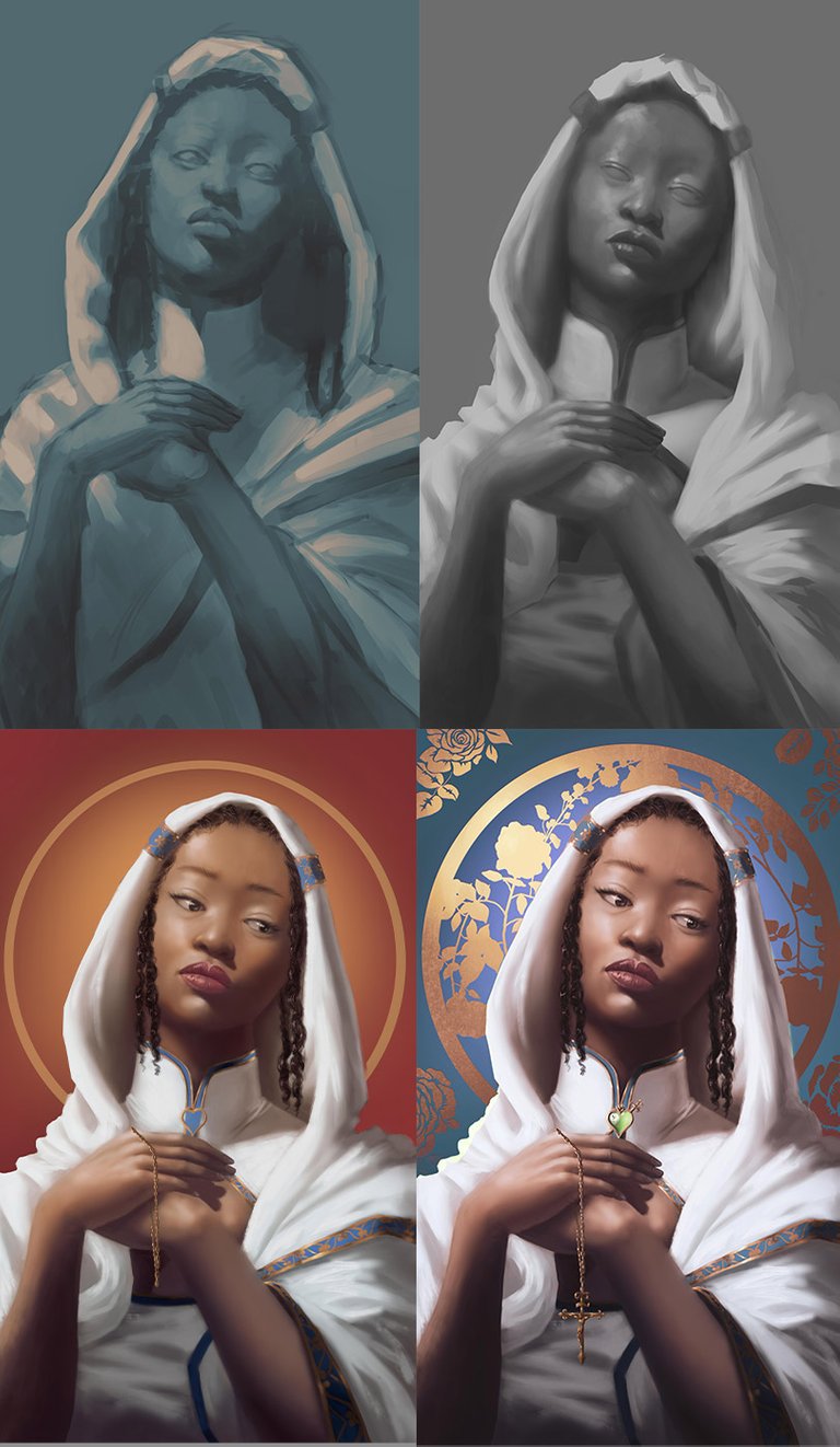
The Process WIP
I went ahead with the two tone paint sketch so that I could get my values and forms right. Later on, I realized that I needed to get back into the black and white tone so that I could get better value definition. One thing that you'll notice when you're doing a two tone but with saturated hues is that you'll lose some understanding on which parts should be darker and which parts should be lighter.
After that it was a matter of using color adjustment layers for digital glazing on top of the black and white. This was only done after I had laid in some mid frequency details on the painting because I really need to make sure that I had all my forms well and ready before I could go into the high frequency details
after that, I just zoomed in and started going at sharpening every form and everything that that was still not define formally and I added a a green heart that is in the stylings of the Catholic heart, popular symbol in Catholic Christianity, and a cross which was an afterthought later on, I put a gold rose pattern on top of a blue tone (the b;ue tone important to constrast the overall warm tone in the rest of the painting.

Thank you for taking that little time to let me share with you.
If you'd like to see or purchase my work and support me, you can visit my socials and Print shop linked below. Otherwise, leave a thumbs up or comment.
Bye-bye!!!
| Twitter | Instagram | ArtStation | BuyMeACoffee | INPRNT Shop |


Tools:
- Huion Pen Tablet (Inspiroy H430P)
- Asus Laptop
- Adobe PhotoShop
- Clip Studio Paint
Very impressive!
Dammnnn great job!! :D