Doctor Blight | Splinterlands Art Contest 303

avatar

YpihifdXP4WNbGMdjw7e3DuhJWBvCw4SfuLZsrnJYHEpsqZFkiGGNCQ3yH4qbgLHhhSKL4NhYQZQxLMmdVdLi3ZtAz3etc4Hkq7XpEo42okT7Ww2JQNC7jWuyTUwzpiwZZ8tc6EnZzZvdHDGJRVnRR5uGjm6FqafScJCqCEy71h8.jpg

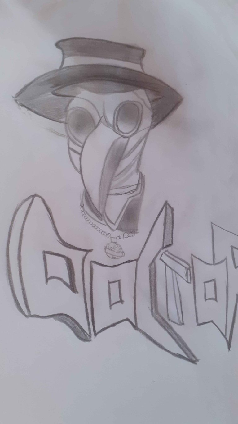
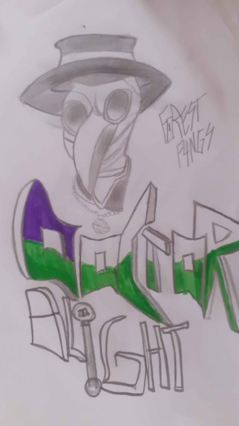
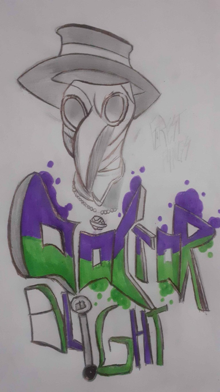
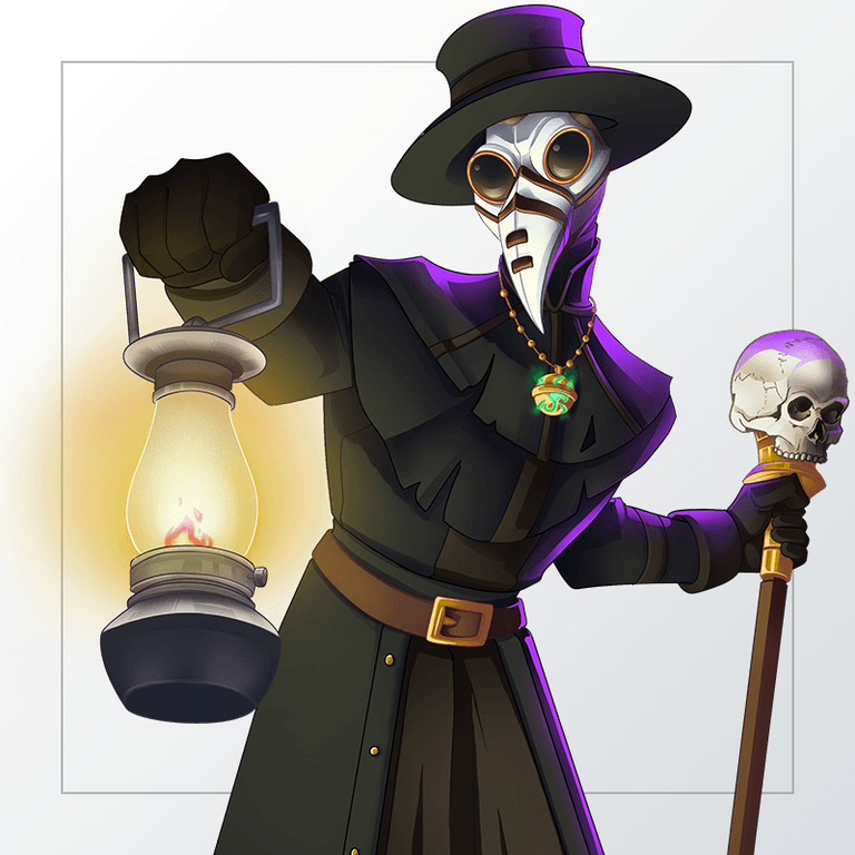
Once again participating in the incredible world of Splinterlands, I find myself coincidentally studying the history of the plague that ravaged the European continent and spread to nearby areas. Yes, I am talking about the infamous "Black Death." In conclusion, the design of this card fascinated me because it brings a style similar to those who studied and treated the sick during that time. The drawing itself is just the interpretation of the upper part of the character, with the name written below, creating a harmonious color relationship.

Retomando la participación una vez más en el increíble mundo de Splinterlands, me encuentro con la casualidad de estar estudiando la historia de aquella plaga que asoló el continente europeo y se extendió a lugares cercanos. Sí, hablo de la famosa "peste negra". En conclusión, el diseño de esta carta me fascinó porque trae consigo un estilo similar a aquellos que se dedicaban a estudiar en esa época y quienes atendían a los enfermos. El dibujo en sí es solo la interpretación de la parte superior del personaje, y por debajo, su nombre de pila, lo que termina de crear una buena relación de colores.

Doctor Blight.png


SCREENSHOTS

I made the sketches based on the character's position illustrated on the card. Then, I reinforced the lines to make them more prominent in the photo and tried to create shadows in some parts, blending them with my finger to give a more realistic effect. This way, I finished composing my interpretation of the original drawing. The title font was designed in an urban style, with some 3D details including lines and borders to add more depth and dimension to the design. Additionally, I added some final touches to highlight the most important aspects of the character.

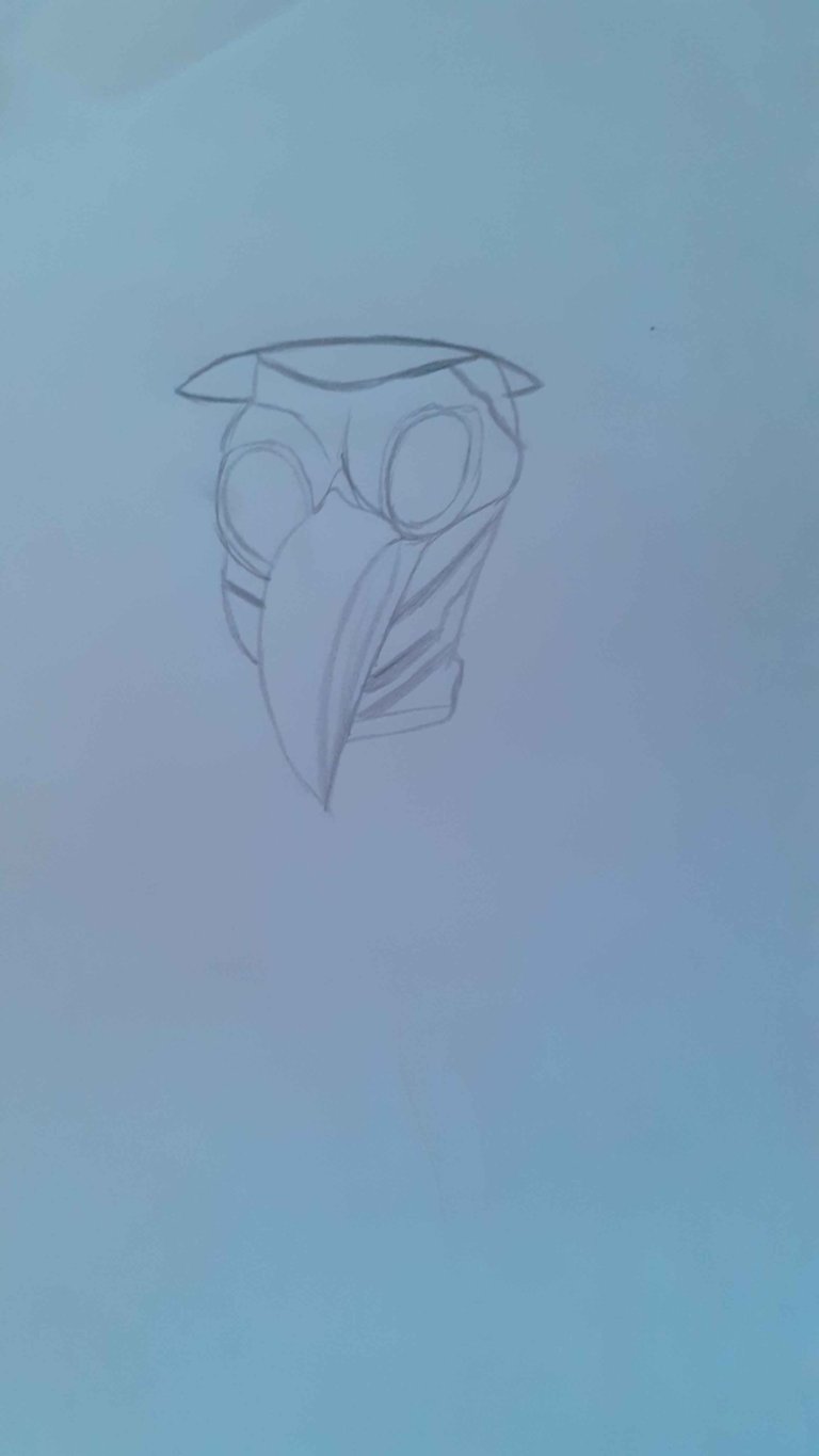
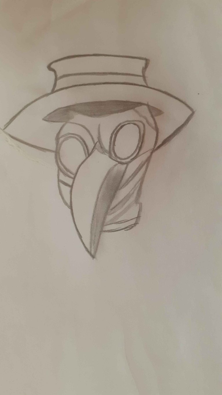
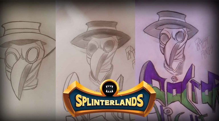
Realicé los trazos en referencia a la posición del personaje ilustrado en la carta. Luego, reforcé el trazo para que se marque mejor en la foto y traté de crear sombras en algunas partes, difuminándolas con el dedo para dar un efecto más realista. Así, terminé de componer un poco la interpretación del dibujo original. La letra del título fue hecha en un estilo urbano, continuando con unos detalles en 3D con algunas líneas y bordes para darle más profundidad y dimensión al diseño. Además, añadí algunos toques finales para resaltar los aspectos más importantes del personaje.

20240718_145137.jpg

20240718_150056.jpg

20240718_160119.jpg

20240718_162218.jpg

After finishing the sketch, with a bit of boldness, I came up with the idea of painting and outlining it with a black pen. This was to give the letters a "visual enhancement." The edges were painted in a "bubbles" style that ascend as the colors blend. I tried to make the letter I resemble his staff to create a connection and not let it get lost in the text. The green helps to recreate the sense of position, while the purple is inspired by the color scheme of the original card design.
Luego de terminar el trazo, con un poco de brutalidad, se me ocurrió la idea de pintarlo y remarcarlo con lapicera negra. Esto es para darle una "mejora visual" a las letras. Los extremos fueron pintados con un estilo de "burbujas" que ascienden mientras se mezclan los colores. La letra I intenté hacerla similar a su bastón para poder relacionarlo un poco y no solo se pierda en lo textual. El verde termina de recrear el hecho de la posición y el violeta se toma del color que acompaña al diseño de la carta original.

20240718_162719.jpg

20240718_175614.jpg


YpihifdXP4WNbGMdjw7e3DuhJWBvCw4SfuLZsrnJYHEpsqZFkiGGNCQ3yH4qbgLHhhSKL4NhYQZQxLMmdVdLi3ZtAz3etc4Hkq7XpEo42okT7Ww2JQNC7jWuyTUwzpiwZZ8tc6EnZzZvdHDGJRVnRR5uGjm6FqafScJCqCEy71h8.jpg

23tbMYAs41qit3gkKEbWSvTzc2khQ1aV1bKu51AFWVKquheT4XecXBgnPdcQ5ocxCNRjz.png


0
0
0.000
1 comments