Update: Rewards Cards
Context:
Card stats / filters for Splinterlands
- Rewards Cards Stats: Rewards Cards Print Stats
- Cards By League Cap: Card game play stats.
Update:
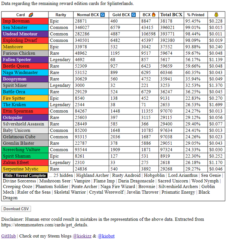
For those using the rewards cards page since the last update you will have noticed a cosmetic change and additional feature:
- Slight increase in font size.
- New Color Scheme - with the aim easier viewing.
- Hide / Reveal Button for completed cards.

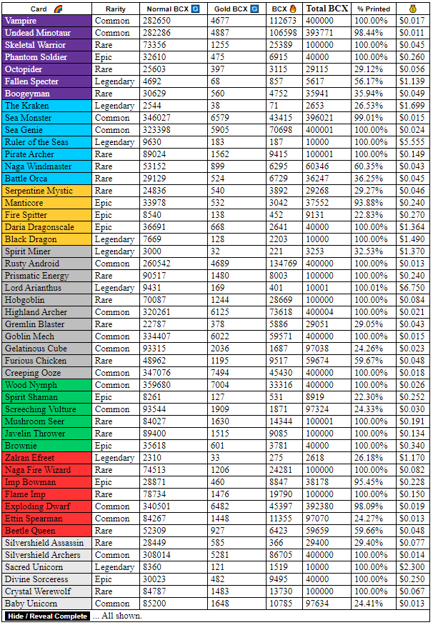
The neutrals are standing out as the biggest group of rewards so far:

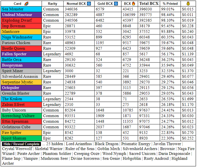
As we approach a new set of Rewards Cards Sea Monster appears to be next in line for the final print:

Feedback Request: / Giveaway 🎁 - 5 winners
Prize : 100 DEC
- Please give feedback on the page 🤞 and recent changes.
- Please make any suggestions should would like to see.
Winners will be chosen randomly after post payout.
Rules:
- 👊 No Upvote, No Resteem, No Follow - just your responding comment required to enter.
- Comment a reply directly to this post within 7 days. A genuine (family friendly) comment responding to the feedback request is required.
- Posted or Commented 5 or more times during the week this post is active.
- Not be on @cheetah's blacklist.
Related post: Splinterlands API Documentation
Enjoy the rest of your day :)
@kiokizz
0
0
0.000
I would like the color to fill the entire row and not just the first cell. Or the row could become bold print when hovering the mouse over it. Makes it easier to jump to the print percentage without using an index finger.
Yes, this please.
I'll definitely explore this soon. Should be fairly easy to add 👌
Posted using Partiko Android
I LOVE this site! I use it all the time, great work! An upvote is on the way from Steem Monsters!
.gif)
Thanks for the support 👍
Posted using Partiko Android
Great site. Thanks!
I really like the hide/reveal feature. When I'm looking elsewhere I often find myself wondering which ones are gone.
👍
Do you use other sites for similar stats?
Posted using Partiko Android
I mainly use PeakMonsters when I'm looking for stuff and that's what I was referring to when I said "elsewhere".
Yours is the only other Steem Monsters one I use I think . . .
I would like a filter to seperate magic melee and archer
Could you explain what your thinking with an example?
I could imagine a grid of tick boxes with more detailed filtering: attack type or splinter being possible options. This would possibly belong more in a somewhat needed update for my Cards By League Cap page.
Posted using Partiko Android