Pyromaniac Splinterland Art Contest
Hello. How are you all?
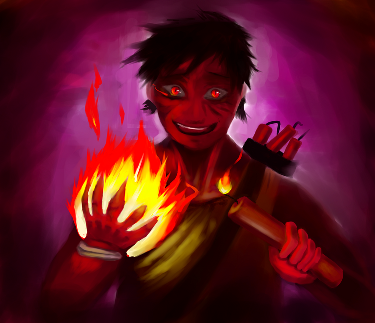
This week I have thought a lot about which character to base myself on and between several characters of which I made a slight sketch. I was inclined to draw "pyromaniac".
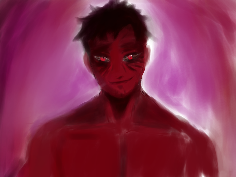
This time I didn't do an exact identical version of the character, but he kept most of his traits, particularly his love of fire, explosions, and his wacky nature.
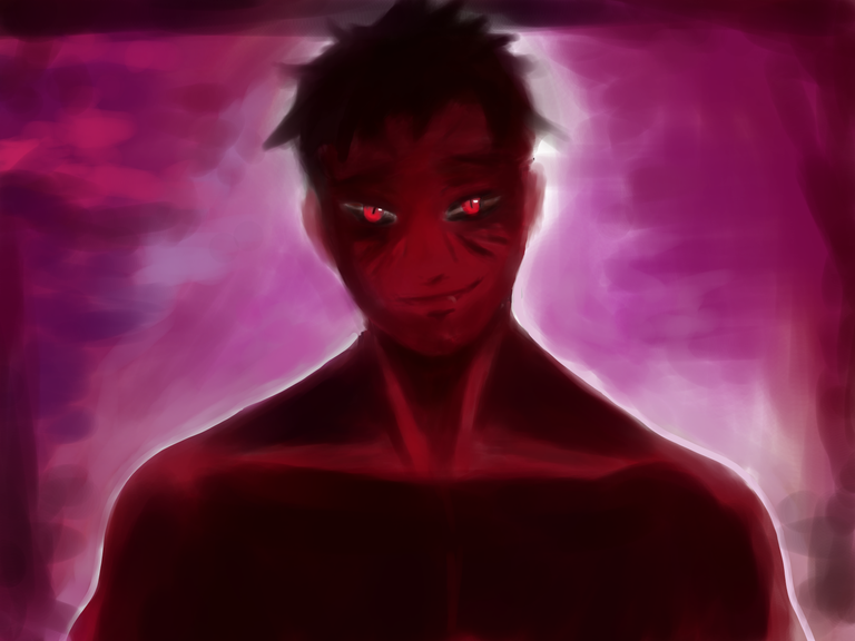
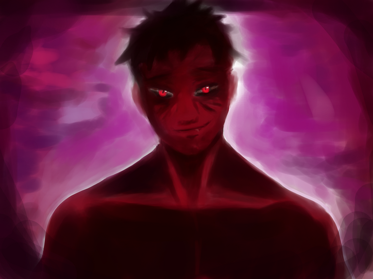
However, I preferred to give him a more reddish skin tone and a somewhat more youthful appearance, but just as psychopathic, unpredictable, keeping his outfit and the weapons he uses. I liked the idea of giving her a reddish skin tone since it felt good to make an allusion to a demon.
Whenever I make a drawing, I try to give special emphasis to his facial expression, and especially to his gaze, which should express his degree of innate madness, where I try to make it one of the elements that stands out within the image.
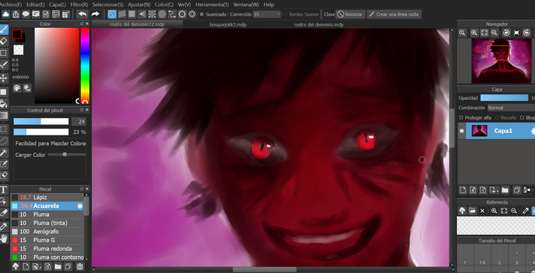
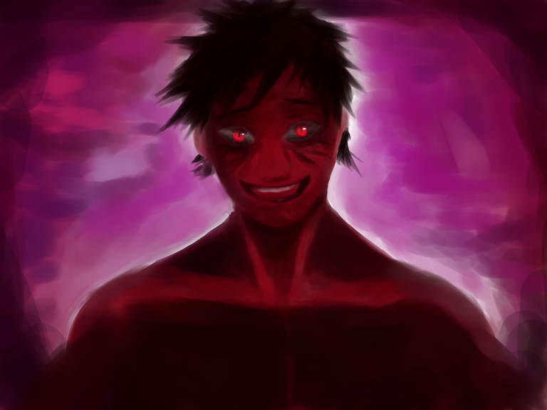
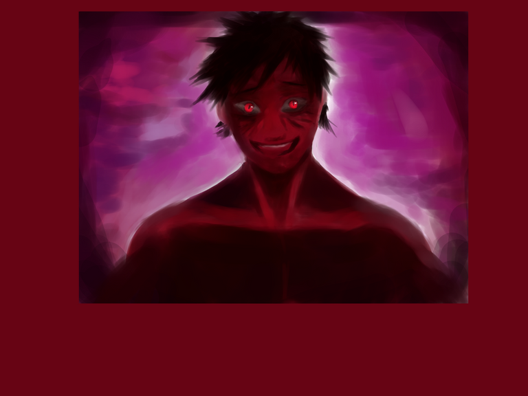
It seemed to me that such a close approach showing only the face would be very boring and not very dynamic, so I resized the image a bit and completed the scene a bit more, since I always like to contextualize my characters a bit, although it is a difficult process. little slower
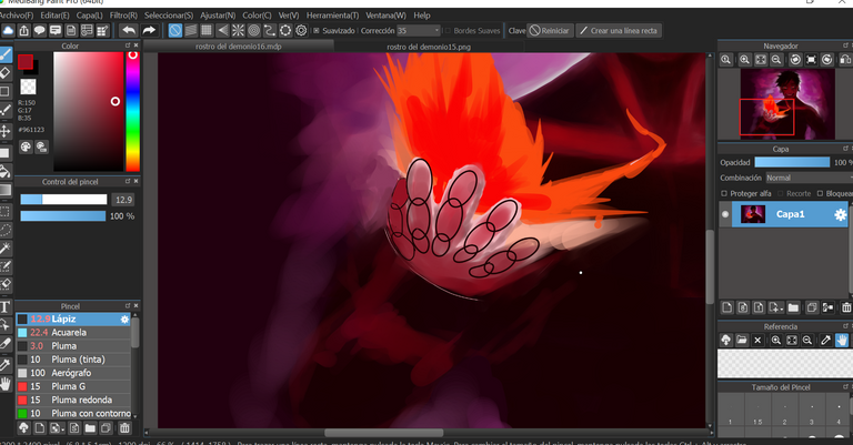
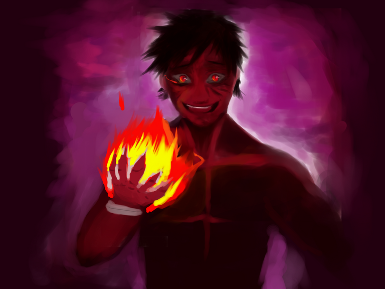
How to draw hands has always been something I don't feel very confident drawing with, unlike faces or bodies, where I can draw them without using any kind of skeleton. I decided to be especially careful when drawing the hand, since it was an especially important element and it had to be pleasing enough to look at so it wouldn't be a dissonant element.For this reason, I used a skeleton that would serve as a reference for the main bones that make up the hands and fingers, trying to keep proportions consistent with the size of the head or body.Fortunately, the result was satisfactory.
I wasn't sure at first what to do with the other hand, but after thinking about how to place it, it occurred to me to make our character with the dangerous look about to do a mischief.
I had to reposition the new element created a bit, since I felt that although it was fine, the position in which the fire was being left did not please me.
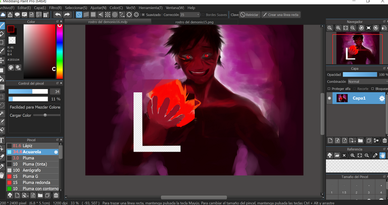
Originally the truth did not intend to equip him with the weaponry, at least not visibly, nor did he intend to put his outfit on him. But it seemed to me that the concept would vary too much from the original card so I later decided to keep them.
This time I did not make a previous sketch but as I was making the drawing I was painting it since it is the usual way in which I usually work and it allows me to be more spontaneous and versatile while new ideas come to mind.
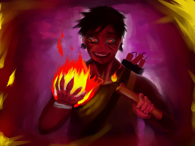
I decided to give a suggestive posture to the action that he must carry out, therefore the elemental thing that I wanted to highlight was his gaze, the fire and the dynamite about to be thrown.
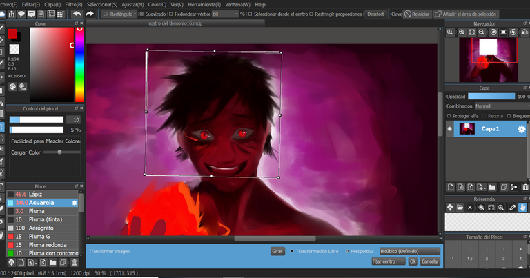
AH, one of the things that caused me concern was that the posture of the face and the height of the eyes never convinced me. So I decided to rotate the head several times a bit until I was convinced of its position, then I adjusted the colors a bit. Blessed be digital drawings with image editing tools. Doing these tweaks on manual drawings is practically impossible without redrawing everything again =).hahahajka Although sometimes he rotated his face so much that he practically looked like the exorcist.
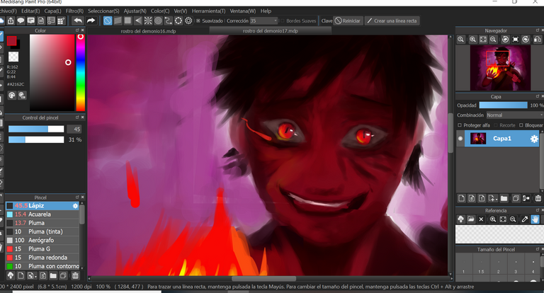
One of the final elements I touched up was the lighting. I decided to make it much more gloomy and dark. I wanted to make it dark enough so that the fire and the gaze would stand out for sure, but not dark enough that the shape of the character would be lost.
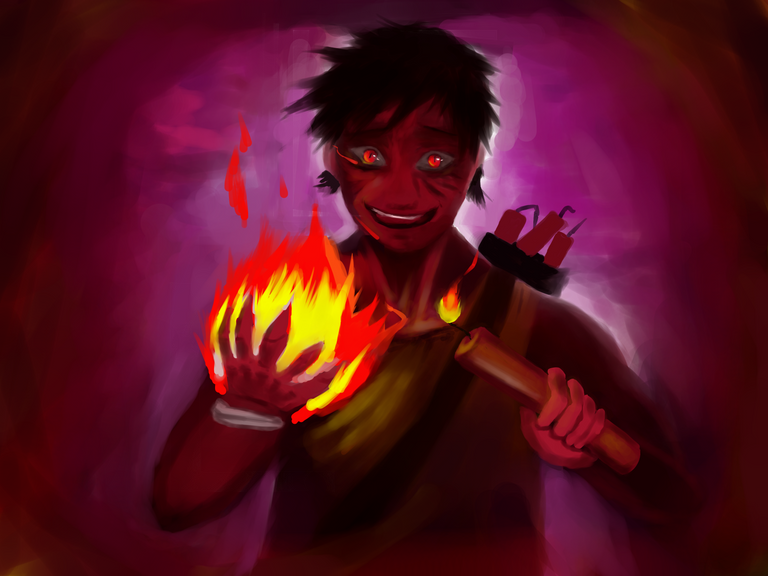
The end result is this;

I think it looks good since the look of the character disturbs me and I feel that he looks directly at my soul so it's fine.
I definitely wouldn't want to run into someone with this look hahahaha. This drawing is totally the opposite of the one I drew last week, don't you think? I needed to balance things hahahaha.
the drawings are usually a mixture of our own perception, a mixture taken from reality and the emotions we experience, that's why there is so much variety.
If you liked the drawing I would appreciate a like. If you've read this far, thank you for visiting! See you soon. I wish you a very good week
Thanks for sharing! - castleberry#6859
