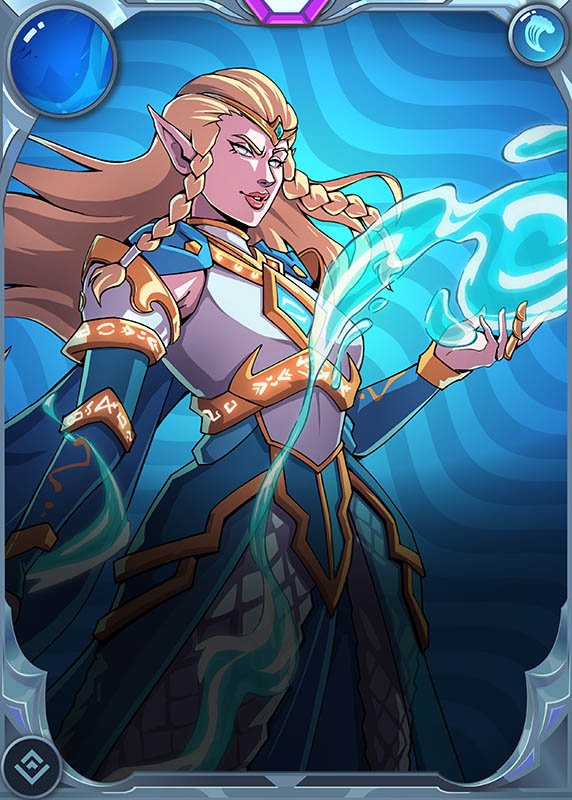
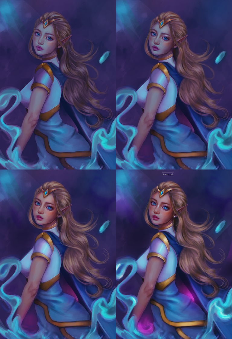
Thanalorian Scion
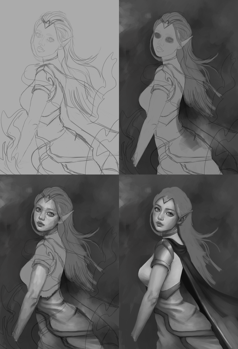
Good evening friends, today for my entry to the Splinterlands contest I wanted to do something different and also work differently, this is the second time that I use the grayscale and then pass the drawing to color, this technique supposedly is better and I must admit that today I can say that if I improve some things of my drawing, however I was left with a terrible headache, for me it was quite difficult and not practical at all, perhaps it is the lack of experience but I felt that my head was going to explode.
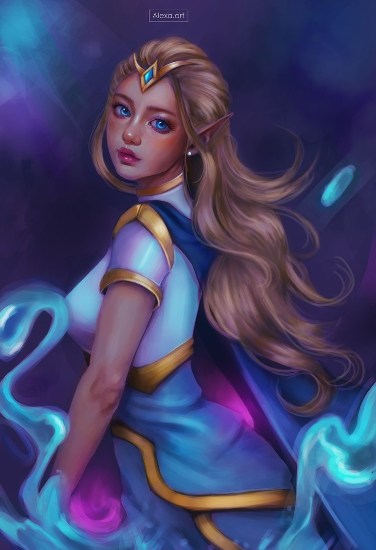
Today I wanted to draw Thanalorian Scion a card that I had never drawn before but I always wanted to do it because it has colors that I like a lot, I tried to make a less overloaded version in terms of costumes because it is only the second time I work with grayscale and I felt that if I put too many elements it would ruin everything, so I changed the costumes making another design, but guided by the original, I hope you like it.

After making my sketch I began to paint using the grayscale, I started first with the background and then my character, placing the lights and shadows on the skin and costume, in a new layer I began to mold everything much better, leaving a more realistic texture.
I added more details and also tried to improve the lights and shadows, this process took me a lot of time because I wanted everything to be perfect so I didn't have problems when adding the colors, I wanted to draw water in front simulating the water that the original card has, after I was satisfied with all the lights, shadows and textures I started to add color, starting with applying a gradient layer using purple and blue tones.
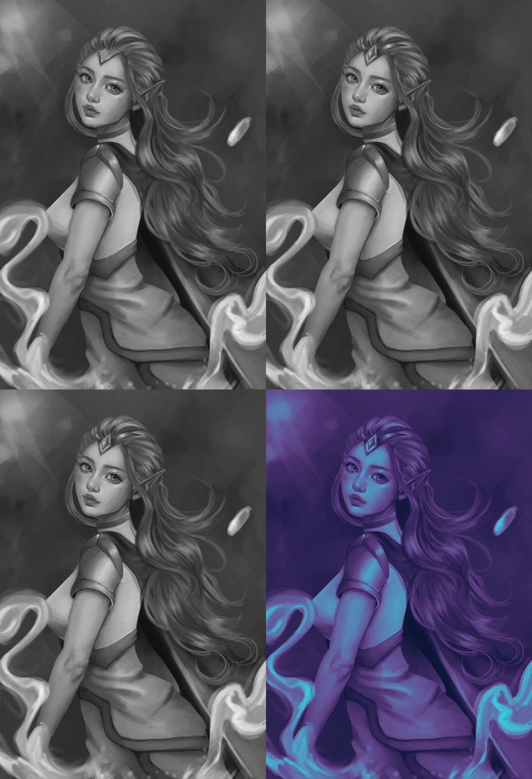
I added a layer with the layer adjustment in “color” and started to paint the skin and the rest of the drawing, giving it very cold tones, I started to experiment with more layers and blending modes to gradually give those color effects that were occurring to me, this part was not as complicated as the last time I did it, but I really did not feel comfortable and had many doubts about what colors to use, after several layers of overlay, screen, soft light, color, etc. I achieved a result that I liked a lot, I loved the tone that I managed to give to the face, it looks quite nice and more alive than before, it was quite complicated but I really liked how everything was at the end.
Tools:
- Photoshop CC 2022
- XP-PEN Deco Pro
Herramientas:
- Photoshop CC 2022
- XP-PEN Deco Pro
Sin duda, mucho talento y belleza. Amo tu estilo de dibujo y esos acabados tan perfectos
Muchisimas gtacias @soyernesto
Beautiful art!
Phenomenal work, as always!!
Thank you!